Climate-Smart Pilots has installed several in situ marine and climatic sensors on the Clyde River, located on the southern coast of NSW. These sensors provide real-time IoT data on the state of both the river system and local weather. Through the information gathered by these sensors, oyster farmers operating on the Clyde River can make informed decisions regarding the state of their lease.
With extreme weather events (e.g., flooding, heatwaves) predicted to become more frequent under a changing climate the information that these sensors provide can be used to reduce uncertainty when making operational decisions. For example, during a heatwave, oysters in an entire lease can be damaged or killed if exposed to high temperatures for an extended period. Farmers with access to in situ IoT data can monitor the conditions remotely and act using the most up-to-date and accurate information, preventing expensive losses.
Capturing IoT data is the first step in aiding end users (e.g., farmers), however, an important factor to consider is how to present these data in an easy to understand yet informative manner. Simple analytics platforms provide a base suite of charts, however, as will be shown in this article, more advanced methods of visualising datasets can simplify their interpretation and aid the decision-making process of end users. One method to achieve this is through layers of abstraction. This involves a very simple front end, which we call the initial layer, as it is the first visualisation users see when accessing the data. The initial layer is followed by at least one layer of in-depth analysis called the hidden layer(s), which provide further context, dimensions and functionality.
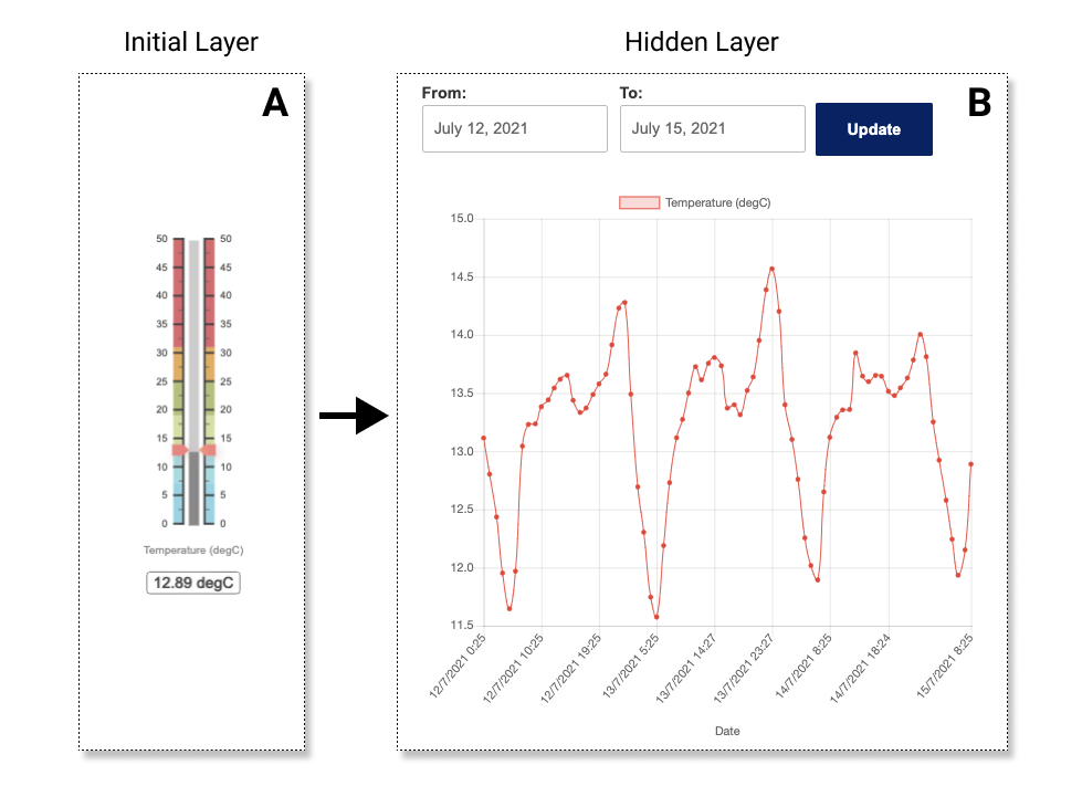
Figure 1. Layers of abstraction for presenting real-time IoT data.
An abstraction of layers is demonstrated in Figure 1 through a visualisation of temperature data on an oyster lease. As the initial layer farmers are presented with a gauge displaying the current temperature which reflects the conditions needed for optimal growth. This gauge symbolises one-dimensional data, i.e., a single data point. The use of colours gives farmers the ability to quickly interpret the state of their oyster lease, with blue indicating low temperature, green representing ideal conditions, orange meaning higher than ideal and red indicating that actions might need to be taken to ensure the survival of their oysters.
From the initial layer farmers can click through to a time-series depiction of temperature readings on their oyster lease. This represents two-dimensional data, with multiple data points (temperature readings) over time (temporal dimension). By hiding this layer from the initial view, we can reduce the complexity of real-time IoT data interpretation. Additionally, this allows us to load informatics faster on our webpage, as most users on the Clyde River access the website when out on the river using their cellular device.
Simplifying complex datasets
The example shown in Figure 1A consists of a one-dimensional (temperature only) dataset which leads to a hidden two-dimensional dataset (temperature and time (temporal dimension)) (Figure 1B). However, on the Clyde River, we have 10 buoys deployed, each with their own salinity and temperature sensor recoding on fifteen-minute intervals. Salinity is intrinsically tied with oyster production as growers require readings above 22 g/kg (at low tide) for harvesting to occur.
If we now use salinity data captured from each of these 10 buoys and try to describe changes over time the methods presented in Figure 1 would not be as effective, as demonstrated in Figure 2. While the overall sinusoidal fluctuations due to the tide are visible, the spatial dimension (i.e., the buoys location) is underrepresented. This is due to the complexity of the new dataset being three dimensional (salinity, temporal and spatial) yet the plot is presenting the data in two dimensions (salinity and temporal) with multiple series (representing different buoys).
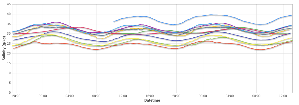
Figure 2. Poor representation of a spatially distributed dataset.
To investigate how we can reduce the complexity of this matrix to end users (farmers) we have combined a satellite representation of the Clyde River with a 2D-linear interpolation to produce an overhead heatmap-view of both the historical and current state of the river (Figure 3).
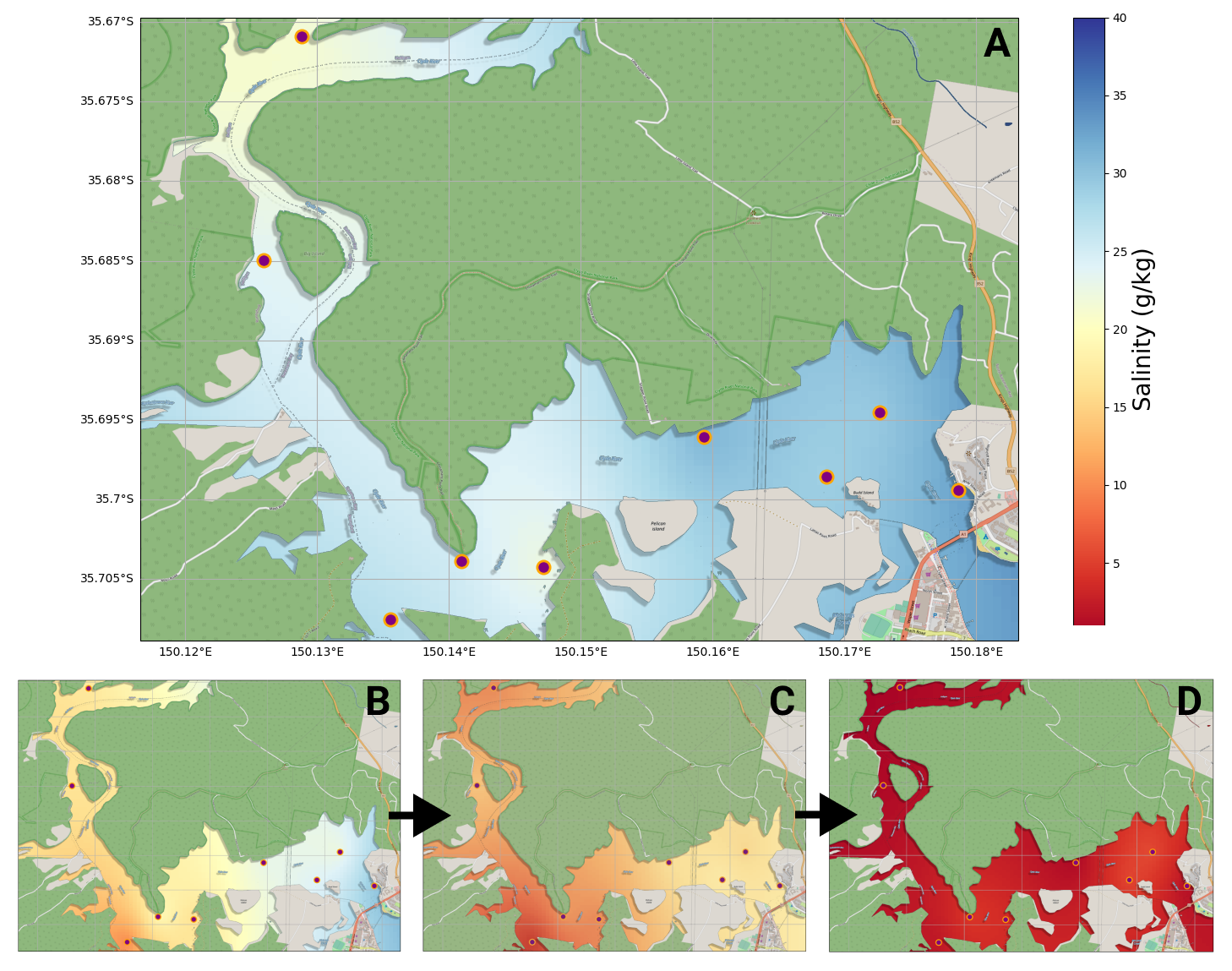
Figure 3. Demonstration of three-dimensional data representation from IoT devices. (A) Depicts typical conditions on the Clyde River. (B – D) Illustrates the transition in salinity that takes during a large rainfall event.
The maps shown in Figure 3 depict salinity readings (g/kg) across the Clyde River with Batemans Bay in the bottom right corner. Colour is again used to represent ideal (blue), moderate (yellow) and low (red) salinity levels spatially. Circle markers are drawn to indicate buoy locations along the river system. These buoys have been placed statically from the mouth of the river to the upper estuary and represent different oyster harvesting regions.
The resulting images in Figure 3 can either be processed as a .gif or a series of static images to include a temporal dimension. To create this representation:
- Queries are made using an API get either:
- The last n number of salinity readings (current representation)
- Salinity readings between two dates (historical representation)
- A map overlay is defined as latitude and longitude coordinates rather than pixels
- A matrix of latitude and longitude datapoints are formulated (the backbone of the heatmap)
- A radial basis function is applied to the matrix using known values captured in step 1 to populate the heatmap
- The overlay is placed on top of the heatmap to provide spatial context
Scripts to create this map can be found at: https://github.com/DPIclimate/HeatMAPS
The 2-dimensional salinity map presented in Figure 3 gives oyster farmers a quick and easy method to both access and interpret the information that is relevant to them for decision making. These data are also important for researchers looking to understand the complex nature of river systems. We are constantly in consultation with growers to refine these data representations. Perhaps the next step to take with the illustration shown in Figure 3 is to provide colour thresholds that align with the initial layer for consistency.
While the maps provide a good representation of the entire relevant river system a spatial interpolation, such as the one provided, comes with a few caveats. Namely, this representation cannot accurately depict currents and eddies located throughout the Clyde River. Additionally, the interpolation does not consider land masses and only represents the top 20 cm of water (as this is where the sensors are situated). However, these are small trade-offs to make for a large reduction in complexity.
The above examples have served as a representation of how an abstraction of layers can reduce the complexity of IoT datasets for decision makers while enhancing the information that these data portray. The use of colour is a key aspect of this, as colour is a universal descriptor of information hence why stop signs (red) and fire exits (green) are the same colour in every country. As the IoT space is experiencing an influx of innovative products these types of multi-dimensional analyses should become more important. While the examples given here were from our Fisheries Pilot this same philosophy is applied to our other pilot sites within Climate Smart Pilots including livestock, cropping and horticulture.